
Friday, 12 April 2013
Thursday, 28 March 2013
Additional Feedback print tasks
Feedback
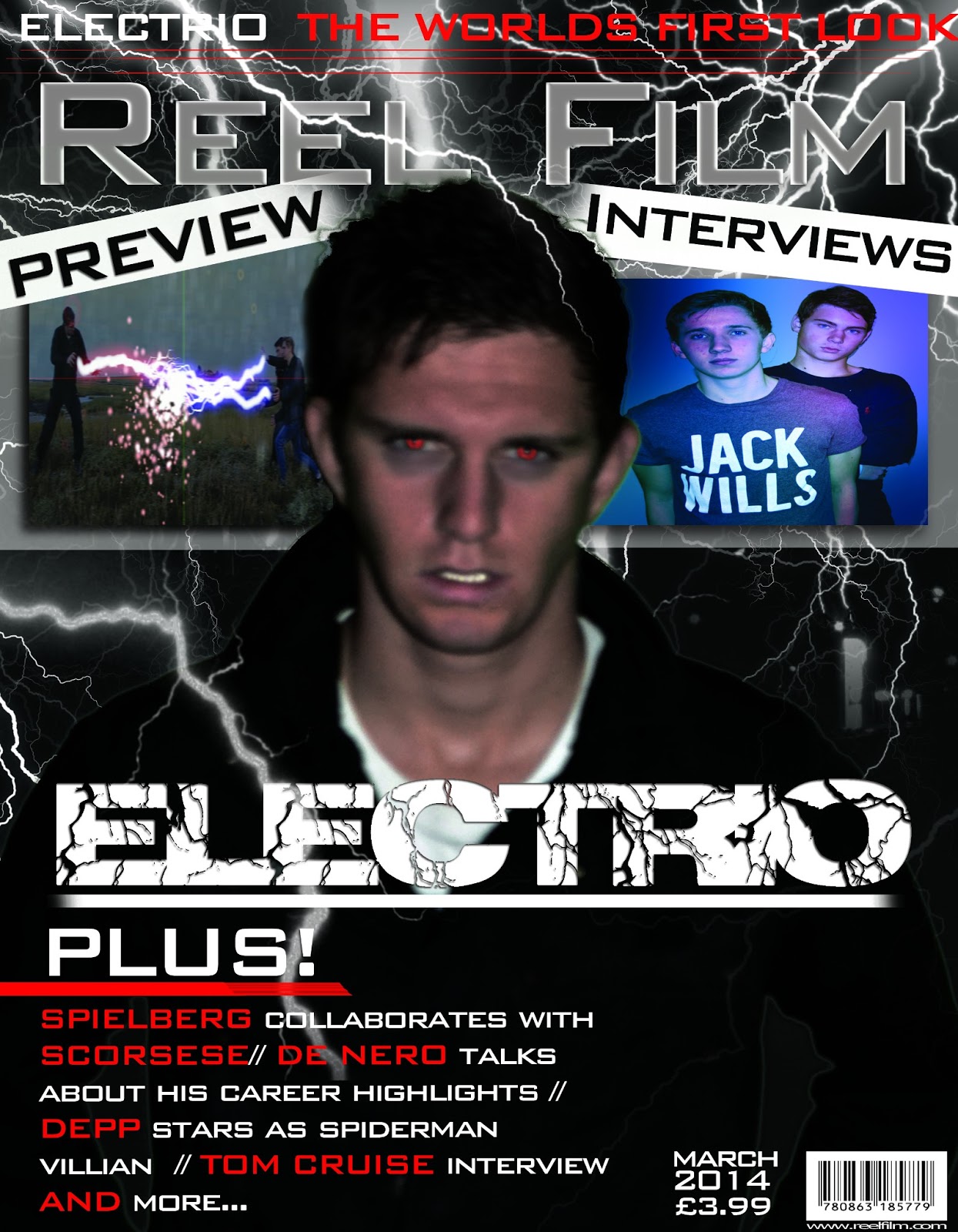
Magazine poster
Magazine poster
To cluttered need to space out writing as it looks to
compact and confusing to the audience
Improved better structure- make more space better layout
More insight into Electrio more of a promotion of our film
Inserted created images instead of using original images to
improve marks
Images of other films make it make more authentic however
use our own productions instead of these online images
Three different fonts- change cartoon font looks un
professional and random doesn’t fit with magazine, doesn't fit with other fonts
gives a different feel to the audience more childish less serious and dramatic
The layout is fuller
The target audience – teenagers- youthful
Title is effective and tag line is appropriate and looks
professional
Banner faded effect looks effective
Images look effective however there not our material need to
create own images and material- add snapshots of our own created films to
promote them.
Electrio title looks effective and suits the lightning in
the background
Make magazine price smaller to fit other information so that
it’s like professional magazines
Change bottom left magazine details, give reader a better
idea of what to expect in the magazine, give more information.
Misspelt denero./ change to Denero talks- Jamie bell is a
dad needs to change seems like something in a celebrity magazine not a film
magazine. Tom cruise sub line is
effective can be kept however say what his new film is.
Poster
Title text looks really professional
Facebook and twitter references give a professional standard
using social media to promote our film
Credit block looks professional however names need to be
changed
Need to add website of film
Eyes have changed gives audience a defined understanding of
the difference in characters
Add impulse into production companies to reference to our
film company
Add apostrophe to Storms punctuation mistakes
Much more professional
Synergy across products needs to be thought about maybe keep
fonts similar
Add a spark of after effect onto the end of our title –
gleam or charge running through it to emphasis the title being linked to
lightning and electricity.
Feedback of print tasks
Feedback
Poster
Poster
Add credit block to add conventions of professional film
poster
Change the Logo – add production companies so that it mirrors conventions on professional film poster
Change the Logo – add production companies so that it mirrors conventions on professional film poster
Change the font as it gives the audience mixed concepts;
instead add a font that relates more to lightning and electricity
Add distribution and Production Company.
Magazine cover
Uneven layout change the layout so that is more of a structured layout that is clearly laid out and looks professional instead of a layout that is all over the place and fonts are at different sizes
Uneven layout change the layout so that is more of a structured layout that is clearly laid out and looks professional instead of a layout that is all over the place and fonts are at different sizes
Tone down the teeth
as they look to white as the colour has been enhanced, so dull down the
contrast so the teeth aren’t so eye catching
Change bar code so that it is more of an appropriate size
and it is in the conventional place of other popular and professional film
magazines
Change date (Issue number or monthly mag?) so that it seems like it’s part of many issues and to create the sense of a mainstream film magazine that is on sale to the public
Change ‘First glance’ to Preview so that it is allot clearer what your poster is actually going to consist of.
Add apostrophe to “cinemas’s” so that it is spell correct
and there are no punctuation mistakes in our poster is that it is more like a
professional standard magazine
Storms into the cinemas – change ‘prepare for the Electrio storm’
Kick ass 2 change- add your own created images and films
otherwise it is taking original copyrighted images
Prices- need to be added so that the audience know how much
the magazine costs and so that we are following the conventions of professional
film magazines
Change the sentence about the interview to something that is
much clearer for the audience to understand so they know exactly what is in the
magazine if they were to purchase it.


Film Trailer 1st Draft and feedback
Feedback: Teaser trailer
Positive
Introduction of the teaser looks good with the impulse inc
Technique good
Excellent music choice – Dramatic music at the start builds up tension and the music gives the film a more action feel.
Introduction of the teaser looks good with the impulse inc
Technique good
Excellent music choice – Dramatic music at the start builds up tension and the music gives the film a more action feel.
Sound
effects work well with visuals.
Titles and voiceover look realistic, makes it seem more professional.
Links with print tasks.
Negative
Tone down the sound as it sounds really loud and bassy.
Speed up of the run as it looks like something out of a comedy
Establish more of a conflict between the antagonist and protagonist.
Production companies sound effect looks like it shouldn’t be there.
Weather man isnt in sync with what he is saying at the start
Improvements
Tone down the sound as it is too loud.
Alter the speed of the run of Callum and Tom as it looks like something out of benny hill.
Car crash scene doesn’t work too well where it goes pitch black.
Get rid of the flash sound effect at the start doesn’t belong there.
Need to make the audio in synce with the weatherman.
Friday, 22 March 2013
Finished 'Electrio' Poster

This is our final draft for our Ancillary task
Fonts used - 'Richter' for the Film title and phrase and 'Simple tongs' for all the other text.
Improvements from last draft
Underlined the main information such as the title, phrase and when the film is out in theatres.
Changed the credit block as some of the character in the last draft were comical.
Made all the characters eyes more red and prominent.
Thursday, 21 March 2013


Wednesday, 20 March 2013
Influential Posters

Tuesday, 19 March 2013

Saturday, 9 March 2013

Tuesday, 26 February 2013
February update
We completed all the filming for our trailer and had putted it all into the structure so that it can be understood. We had continued editing the scenes with after effects so that we could create the special effects to portray the actors lightning powers.
We completed our final drafts of our print tasks adding conventions such as a credit box on our poster and finishing touches to our magazine so that it looks more professional for example we choose to use two primary colors red and white on our font text so that it looks professional and so there are not too many colors distracting the audience.
We also showed our finished production to the our media A level class and on the social networking site Facebook as well as putting it on you tube so that we could attain a wide range of feedback. We then took the feedback we received and got together as a group to try and improve on our production to the best quality. We found that the best feedback we attained was from the social networking site Facebook as most of our friends on Facebook fit into our target audience age group of 13-18 so that the feedback we received was mainly from this age group which was effective as they were the age group that we was trying to reach.
We also created our electronic evaluation of our production using the same camera we used for our production, recording through its mic we were able to complete our evaluation following structured questions. We also added video from our production and images to our evaluation so that we can give the viewer a visual display of what we are talking about allowing us to analyse our production whilst actually providing video to give the viewer a more thorough understanding of what we did in our production and why.
Wednesday, 6 February 2013
Poster Fourth Draft

Added a Credit block below the Title which was missing in the last draft which we used as most posters have them.Furthermore, the production company "Cold Stone" and Distribution company 'Impulse Inc' have both been added to follow the conventions of a real film poster.In addition, we've added social media to the poster with the twitter hash tag to get the poster trending and also the Facebook site. I've also changed the font used for the title which is 'Richter' which aids the electric feel we need to get across. Also we've added 'A storms coming' as a little phrase for a poster.Made the eyes on the character have colour of either red or blue depending on if they evil(red eyes) or good (blue eyes). Lastly, I changed the colour correction on the characters illuminated to a more grey and colourless feel which carries on the theme of the gloominess of the poster.
Tuesday, 29 January 2013
January update
We produced our second draft of our print tasks as we has attained feedback from the class on our first draft, we wrote down all the feedback we attained then we all got together as a group to see how we can take the positive and negative feedback and use it to further improve our print designs.
We continued filming and started filming in our main location at riverside. We started filming the main fight scenes practicing the moves so that they could be perfect and will look realistic in our final production. We had good weather when we was filming with blue skies which was a problem as we needed a gloomy setting with fog or rain, so we started looking at online tutorials which show how you can generate rain through editing programs so that we can create a storm to fit with the big storm in our production that gives our actors their unique powers and so that we could create a gloomy and mysterious atmosphere.
We continued filming and started filming in our main location at riverside. We started filming the main fight scenes practicing the moves so that they could be perfect and will look realistic in our final production. We had good weather when we was filming with blue skies which was a problem as we needed a gloomy setting with fog or rain, so we started looking at online tutorials which show how you can generate rain through editing programs so that we can create a storm to fit with the big storm in our production that gives our actors their unique powers and so that we could create a gloomy and mysterious atmosphere.
Monday, 31 December 2012
December update
Having chosen our target audience of teenagers from 13-18 we started planning the design for our poster print task having already started on our magazine first draft in November.
We had completed most of our research into conventions so that we were able to create a professional layout and structure of the poster so that it looks effective and to a professional standard with conventions that are used.
We used the green screen images of our actors as we wanted to follow the layout that we had created in our magazine front cover with the image of the actor in the page, however we choose to use all three of the main actors together so that the audience can relate to the actors in the film and in our magazine front cover.
Having researched the popular conventions of the poster we looked on to how to layout our credit box, production companies so that it looked effective and professional. We also decided on changing the characters eyes having two actors with blue and one with red to show the dispute between them and it insinuates the concept of them having powers and not just being ordinary people.
We also continued filming, working on filming the chase scene in the woods and the car chase scene.
Wednesday, 26 December 2012
Call Sheet


 |
Thursday, 20 December 2012


Analysis for Chronicle trailer
Music that is used in the trailer:


The music that is used is upbeat and gives a sense of
normality. The music at the end contrasts and is spooky this is effective as it
is used when they acquire their powers and creates a mysterious atmosphere, the
music also creates an enigma leaving the audience wanting more
How have they used music to create different atmospheres?
Spooky music is used
to create a mysterious and curious atmosphere

This is a screenshot of when they find the meteor that gives
them their powers, there is spooky music playing in the background that engages
the viewer making you want to find out more.
How have they tried to attract a young audience in the trailer?
The film attracts a
teenage audience by the use of the modern music playing in the background:

This is when Jessie j price tag is playing in the car at the
beginning this highlights the young age group of the actors and the audience
that it’s trying to address, the audience can relate to this song and gives the
idea of this being realistic and at modern time.
Special effects:
In this trailer there are lots of different special effects
used. Special effects can be used to separate each clip from each other; they
can also be used to make it look like it is being filmed from a hand held
camera. In this trailer they have used the transitions effectively as they
aren't over used, and separate each clip from each other in a professional
standard. They have also used them to create different atmospheres.
Transitions:
In this trailer there are numerous of transitions used, so here are some examples of some of them:
Pixerlated

This transition is a Pixel effect. So in this clip it starts
pixerlated and then it fades into the clear picture. This effect is used to
create the atmosphere of them in a car using a hand held camera.
Shutter

This is a shutter special effect and they have used this to
create the sense of the hand held camera, and you can see that the camera has
shuttered causing this effect. The reason for this is to make it feel like you’re
watching it in third person, so it feels like as if you are there.
Horizontal bars

This is a horizontal bars effect and this is used to make it
look like the clip is being played on VHS player.
Static

This is a static special effect and this is again used to
make it look like it is being played back through the camera or on an old
telly. This transition is used to create a sense of a mysterious atmosphere.
Flash

This is used right at the end of the clip and it is used
just as they look at the meteor, so this flash makes it look like something has
happened and this is when they obtain their powers! After the flash happens the
trailer ends, so this is used to create a cliff hanger so then people will want
to watch the actual movie to see what happens after they get their powers.
Special effects/Transitions conclusion:
In this trailer they have used lots of different types of
special effects. The makers of this trailer have purposely used these special
effects to create a first person effect; they have done this to make it look
like everything is being watched back on a hand held camera. For example they
have used a pixel effect and this makes it look like the camera is out of focus
and they have also used a shutter effect so this makes it look like someone is
holding the camera as it isn't still. So overall they have made this trailer to
make you feel as if you are there with them
Camera work:
They have used a hand held camera to give us the sense of
first person. By using first person it makes us feel like we are there with them
and that we are the camera man. They have also used a lot of different shot
types to create the first person feeling. They have used a lot of different camera angles
to create different atmospheres and also to highlight certain objects that may
be in the clip.
Genre:
The genre for the film varies I feel it has areas of comedy,
action and drama which is effective and aims for a teenage audience who are
interested in these specific genres of films.
Here are different print screens to show the three different types of genre:
Comedy

The genre of comedy is enlisted in the film as the teenage
humour is put across in the film that brings the viewers closer to the
relationship between the friends give us a realistic look into their lives. In this
clip they have used their powers to make the teddy levitate, this come across
as comedy as it is a funny clip where they try to scare the girl.
Action

The action goes on throughout but it is shown in this scene
once the character has attained his powers and begins to use them to break the
law, stealing from a shop as shown above
Drama

The genre of drama is also shown as this clip creates
suspense and draws the audience in as there perfect lives start to show a side
of evil.
Sunday, 16 December 2012
Wednesday, 12 December 2012

Monday, 10 December 2012
10/12/12- Consent forms
We designed a Consent Form so that each participant understood what was taking place in the film, and just in case the public questioned what we were doing.


Thursday, 6 December 2012
Third Draft

Improvements from last draft
Changed the background completely and used one of the photo's from our location shots to place in the background. Only used white lightning as red and blue looked tacky. Added the website aswell as when the film is in theatres.
Target audience Interview
What are the main genres of films that you are interested in?
Well, honestly I have a passion for action and comedy films I find that its easy to get swept up in the film and start to fill for the characters which is amazing. I do also have a keen interest of fantasy films as the whole superhero and villain roles are classic and the like of productions from marvel and DC lead the fantasy film world for me.
What characters in films do you warm too?
Personally I always feel that characters that I can relate to are the most entertaining and through the use of empathy I can really get into the characters shoes. For example if they are of a similar age or are in school or education I find it really easy to relate to the character and see from there point of view. Such as the British comedy TV series The Inbetweeners which was very popular I feel this was because it related to its target audience of teenagers who would be still in educations like the characters in the program however having a humorous spin on there everyday school life, I feel this is a prime example how relating to your target audience can benefit to the popularity of your production.
What defines a good film too you?
I feel the leading action films are clearly defined by the special effects and stunts that are shown on screen this is because it really gives a thrilling experience that me as a viewer finds hard not to be completely drawn in too I also feel that a good comedy is one where the characters are not overly cheesy and are believable. For example action films such as Rambo when the protagonist borders on invincible is what far to over he top.
Is it only big productions your interested in?
Of course I am a huge fan of blockbusters and Hollywood productions but the small independent low budget films that have a relate table story or characters in a similar setting to me I find equally engaging. Such films as kidolthood where there are young teenagers are in a setting such as London which can be related to me as I have been to the locations in the film who have a engaging violent story line is a prime example of how a low budget film can captivate a young audience who has experience or heard of similar experience, the reality of the film to me makes it believable and not unrealistic.
You say you enjoy fantasy films what attributes of the film do you find intriguing?
Well really its more of just the unique and magnificent ways in which normal life can be twisted in films such as Avatar which are people from Earth that voyage to different worlds in the universe, I like that they keep the foundation of life on Earth and then create a sense of huge life out there, I find it engaging and just makes you really think about the journey of the film. The effects and animation in the fantasy films are remarkable, I feel it broadens the imagination and for people who like to be in the edge of there seat fantasy films really keep the viewer on constant edge with the astounding ways and situations that the characters get into in our world or the next.
Friday, 30 November 2012
November Update
From the beginning of November to date we have been following our script and call sheet for filming Electrio having filmed various different shots in the location to make sure that visually the fight scene and chase scene are clear that the transition and effects that show our powers are added they can be clearly seen in the light. We have continued researching different transition and effects on professional editing sites so that we can get the foundations of ideas for the lightning transitions in our production.
We had also spent most of the later end of the month researching leading film magazine covers such as Empire and Total film to understand the conventional style and layout of these popular selling magazines, such as the pugs, master head, strap line, anchorage text and banners are all in the conventional place, look professional and clear. We kept the house-style so that it has its own distinguishing design that's distinctive from competitors.
We produced a magazine cover for a magazine we named "REEL FILM" we felt this was a significant title, we used a lightning background to convey the storm in our film and used a bold font that's eye catching but holds a professional look. Leading up to our magazine photo design we had a photo shoot in front of a green screen doing various different poses so that we could choose for the most effective photos to show our characters, we created a magazine cover for each character so that each front cover has its own spin to the personality of the character.
As a group we reviewed what we feel would be our target audience and created a thorough audience profile for what we feel this audience is in this case we believe that its a younger audience of teenagers from 13- 18 as we feel that they can relate to the life's of the teenage actors in our film that are still in education.
Our research into synergy also continued we feel that synergy is so effective by uploading our videos to platforms such as Blogger, Facebook and YouTube which creates a brand identity for Impulse inc as our productions can be linked through the sites and create a recognisable house-style to our followers.
Thursday, 29 November 2012
Budget
Our film doesn’t require much money, this is because we already are the correct technology equipment and also all the props that we would like to use; we already own so we don’t have o buy anything. But what we do have to pay for is petrol, this is because we have a lot of different scenes and they are in different locations so we will have to drive there. Also another thing we need to pay for is food and drink as we will be spending a lot of time filming so we will need to take breaks and have something to eat and drink. So overall our budget to make this film is rather small, so we don’t have to worry about not be able to complete the film due to money problems.
Tuesday, 27 November 2012


Monday, 26 November 2012


Subscribe to:
Comments (Atom)