
Thursday, 28 March 2013
Additional Feedback print tasks
Feedback
Magazine poster
Magazine poster
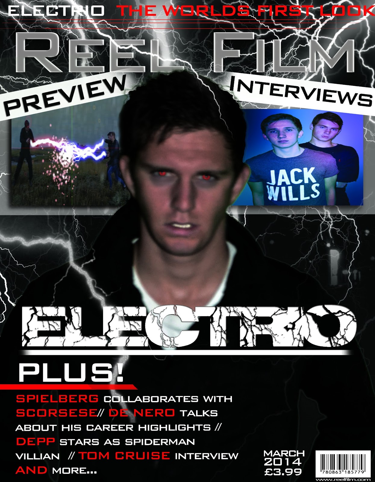
To cluttered need to space out writing as it looks to
compact and confusing to the audience
Improved better structure- make more space better layout
More insight into Electrio more of a promotion of our film
Inserted created images instead of using original images to
improve marks
Images of other films make it make more authentic however
use our own productions instead of these online images
Three different fonts- change cartoon font looks un
professional and random doesn’t fit with magazine, doesn't fit with other fonts
gives a different feel to the audience more childish less serious and dramatic
The layout is fuller
The target audience – teenagers- youthful
Title is effective and tag line is appropriate and looks
professional
Banner faded effect looks effective
Images look effective however there not our material need to
create own images and material- add snapshots of our own created films to
promote them.
Electrio title looks effective and suits the lightning in
the background
Make magazine price smaller to fit other information so that
it’s like professional magazines
Change bottom left magazine details, give reader a better
idea of what to expect in the magazine, give more information.
Misspelt denero./ change to Denero talks- Jamie bell is a
dad needs to change seems like something in a celebrity magazine not a film
magazine. Tom cruise sub line is
effective can be kept however say what his new film is.
Poster
Title text looks really professional
Facebook and twitter references give a professional standard
using social media to promote our film
Credit block looks professional however names need to be
changed
Need to add website of film
Eyes have changed gives audience a defined understanding of
the difference in characters
Add impulse into production companies to reference to our
film company
Add apostrophe to Storms punctuation mistakes
Much more professional
Synergy across products needs to be thought about maybe keep
fonts similar
Add a spark of after effect onto the end of our title –
gleam or charge running through it to emphasis the title being linked to
lightning and electricity.
Feedback of print tasks
Feedback
Poster
Poster
Add credit block to add conventions of professional film
poster
Change the Logo – add production companies so that it mirrors conventions on professional film poster
Change the Logo – add production companies so that it mirrors conventions on professional film poster
Change the font as it gives the audience mixed concepts;
instead add a font that relates more to lightning and electricity
Add distribution and Production Company.
Magazine cover
Uneven layout change the layout so that is more of a structured layout that is clearly laid out and looks professional instead of a layout that is all over the place and fonts are at different sizes
Uneven layout change the layout so that is more of a structured layout that is clearly laid out and looks professional instead of a layout that is all over the place and fonts are at different sizes
Tone down the teeth
as they look to white as the colour has been enhanced, so dull down the
contrast so the teeth aren’t so eye catching
Change bar code so that it is more of an appropriate size
and it is in the conventional place of other popular and professional film
magazines
Change date (Issue number or monthly mag?) so that it seems like it’s part of many issues and to create the sense of a mainstream film magazine that is on sale to the public
Change ‘First glance’ to Preview so that it is allot clearer what your poster is actually going to consist of.
Add apostrophe to “cinemas’s” so that it is spell correct
and there are no punctuation mistakes in our poster is that it is more like a
professional standard magazine
Storms into the cinemas – change ‘prepare for the Electrio storm’
Kick ass 2 change- add your own created images and films
otherwise it is taking original copyrighted images
Prices- need to be added so that the audience know how much
the magazine costs and so that we are following the conventions of professional
film magazines
Change the sentence about the interview to something that is
much clearer for the audience to understand so they know exactly what is in the
magazine if they were to purchase it.


Film Trailer 1st Draft and feedback
Feedback: Teaser trailer
Positive
Introduction of the teaser looks good with the impulse inc
Technique good
Excellent music choice – Dramatic music at the start builds up tension and the music gives the film a more action feel.
Introduction of the teaser looks good with the impulse inc
Technique good
Excellent music choice – Dramatic music at the start builds up tension and the music gives the film a more action feel.
Sound
effects work well with visuals.
Titles and voiceover look realistic, makes it seem more professional.
Links with print tasks.
Negative
Tone down the sound as it sounds really loud and bassy.
Speed up of the run as it looks like something out of a comedy
Establish more of a conflict between the antagonist and protagonist.
Production companies sound effect looks like it shouldn’t be there.
Weather man isnt in sync with what he is saying at the start
Improvements
Tone down the sound as it is too loud.
Alter the speed of the run of Callum and Tom as it looks like something out of benny hill.
Car crash scene doesn’t work too well where it goes pitch black.
Get rid of the flash sound effect at the start doesn’t belong there.
Need to make the audio in synce with the weatherman.
Friday, 22 March 2013
Finished 'Electrio' Poster

This is our final draft for our Ancillary task
Fonts used - 'Richter' for the Film title and phrase and 'Simple tongs' for all the other text.
Improvements from last draft
Underlined the main information such as the title, phrase and when the film is out in theatres.
Changed the credit block as some of the character in the last draft were comical.
Made all the characters eyes more red and prominent.
Thursday, 21 March 2013


Wednesday, 20 March 2013
Influential Posters

Tuesday, 19 March 2013

Saturday, 9 March 2013

Subscribe to:
Comments (Atom)